Reimagining the future of retail.
Coinstar Corporate Website Redesign
Helping Coinstar reimagine their corporate web experience.
Coinstar, Inc. delights and engages consumers through its simple and convenient automated retail services, while increasing revenue for retailers and providing shareholders meaningful returns. However, their online presence was severely out of date, and in desperate need of an overhaul.
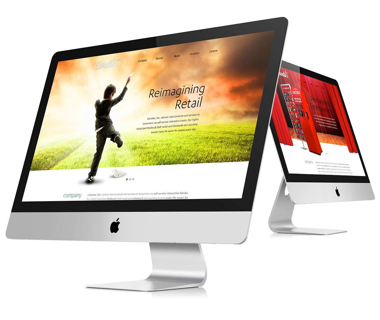
Leveraging inspiration from their forward-looking brand approach of reimagining retail, Coinstar set out to reimagine their own corporate website. The result was a top-to-bottom upgrade of their existing web experience.
The Problem
"From our website we seem boring, stodgy and outdated."
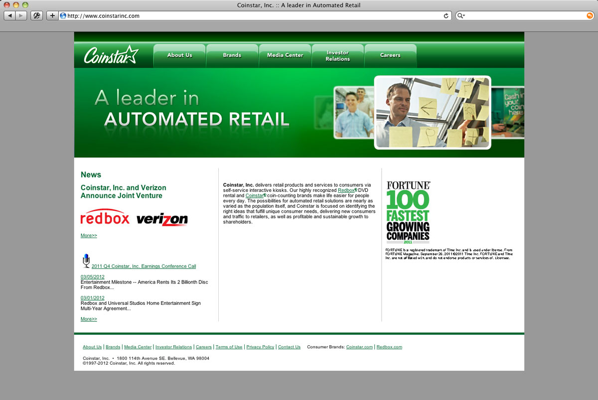
The existing Coinstar corporate website was outdated and uninspiring, with a rigid structure that made updates challenging. Based on engagement data, homepage drop-off rates, as well as top level sections, were well above acceptable standards, with only about a third of total pages being viewed. Research also showed significant confusion between the Coinstar line of business (LOB)—the green coin counting machines—and the corporate entity, which included additional product lines such as Redbox and a coffee kiosk.
With a large Redbox public announcement looming a month away, corporate leadership wanted to make a significant change—moving away from their boring, stodgy website, to something more contemporary, engaging, and flexible. So, with less than a month lead time, efforts were kicked off to create a new corporate website from the ground up, with the project being broken down into three phases.
Phase 1:
Rethinking the information architecture.
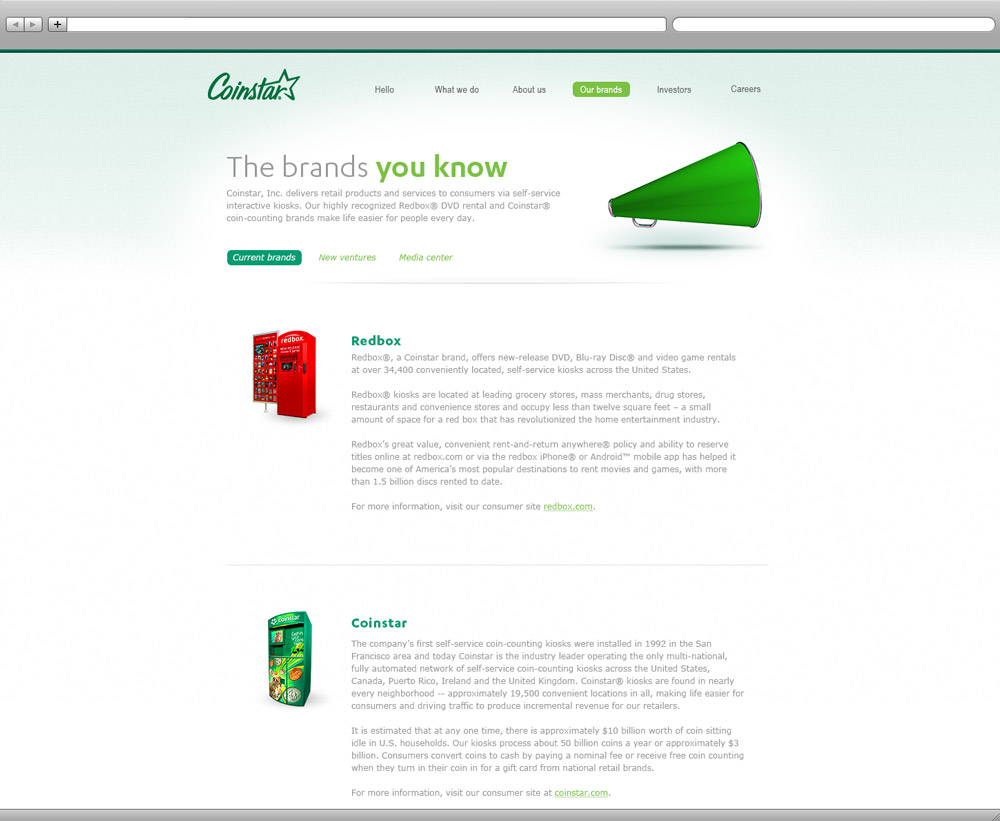
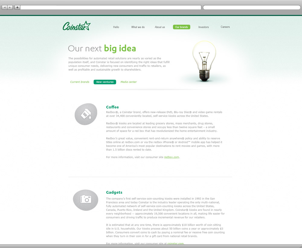
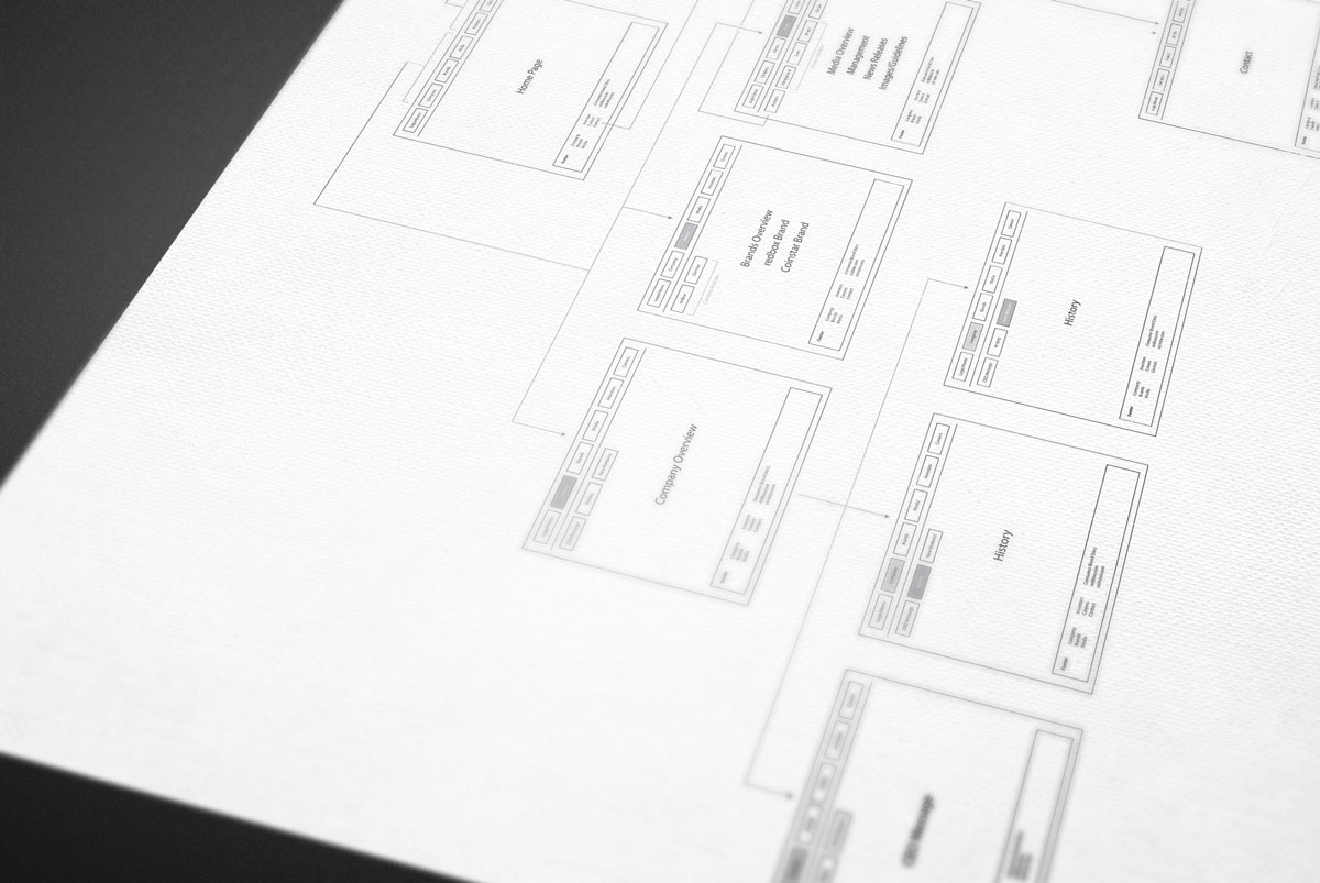
The first step was to rethink the site’s information architecture in order to streamline the content sections, reduce overall page count, and remove redundant information. An audit was conducted of the existing website, mapping and defining all of the content in order to better organize the content and set priorities. A clear emphasis was put on foundational company information and product brands, in order to better distinguish between the corporate identity and the coin counting LOB.
From there an optimized navigation structure was created, leveraging a simple top level + second level menu scheme. This streamline navigation pattern allowed all content on the site to be accessible from any page, and the reduced the likelihood of users having to drill down or get lost while exploring.
Phase 2:
Reimagining an entirely new look & feel.
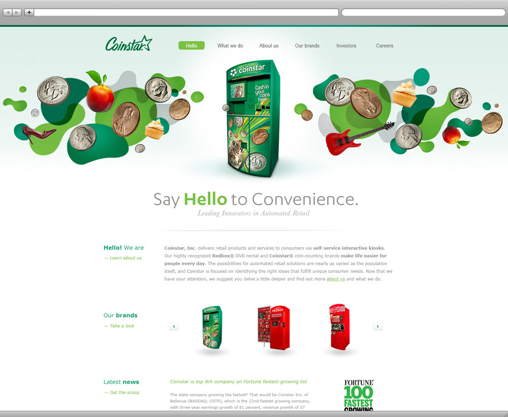
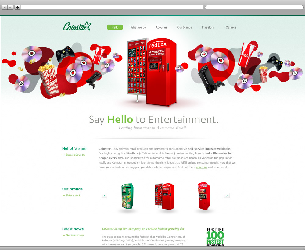
The next step was design exploration. Leveraging Coinstar’s corporate brand theme of “Reimagining retail,” several visual and messaging concepts were created to emphasize the imagination and wonder that come with the pursuit of innovation and invention. Common in all concepts was the idea of exploration through the use of inspiring imagery to more dream-like visual patterns.
In addition to the visual elements, a more friendly and approachable tone was taken for the various messaging components. With one concept using a more casual “Say Hello” introduction meant to welcome users in; inviting them to explore all of the possibilities of automated retail, including some yet to be fully imagined.
Phase 3:
Rebuilding from the ground up.
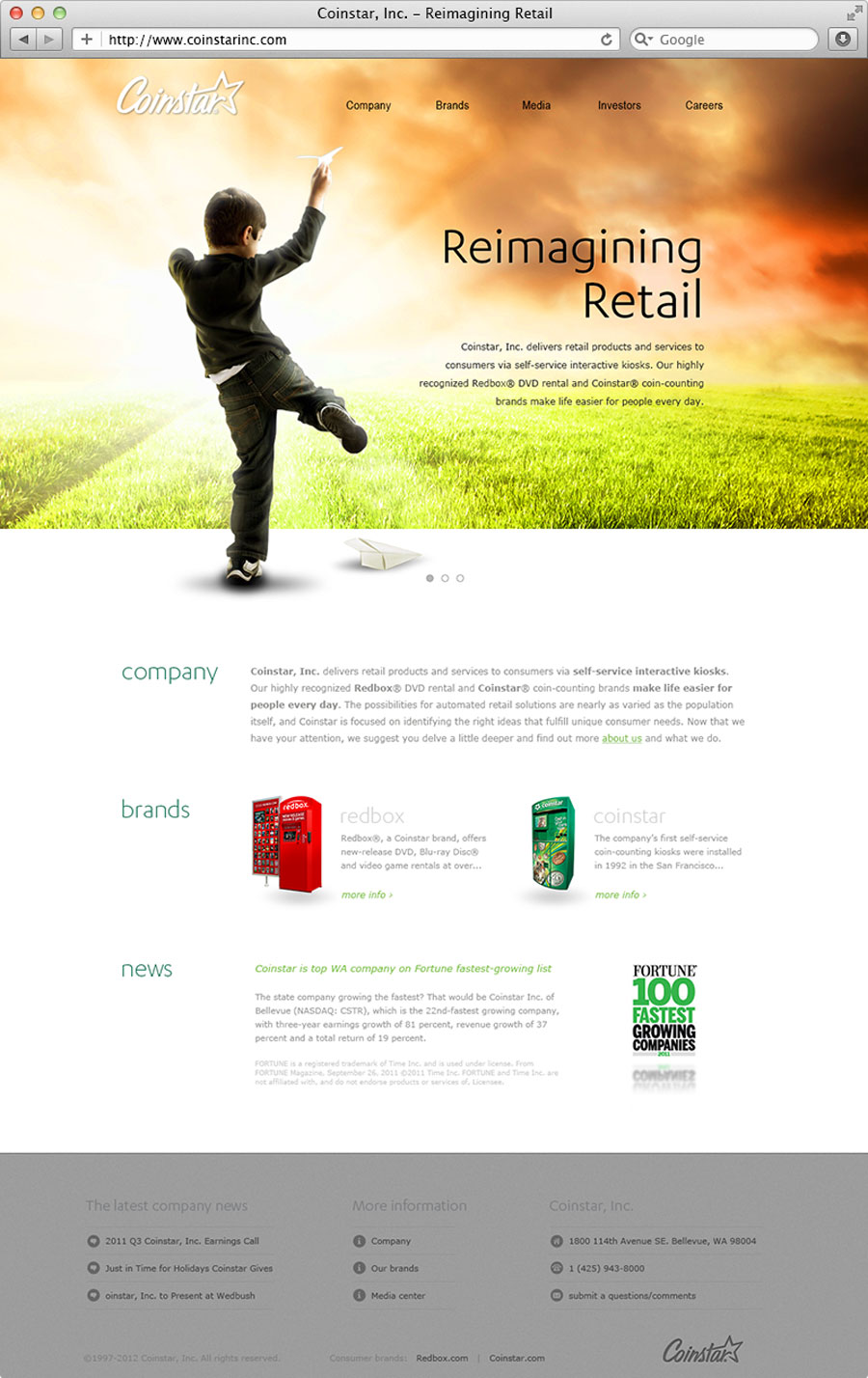
Of the concepts reviewed by the Coinstar executive team, it was determined that a more traditionally-corporate approach was preferred—leveraging a clean, straight-line look with large heroic imagery and a friendly, but professional tone.
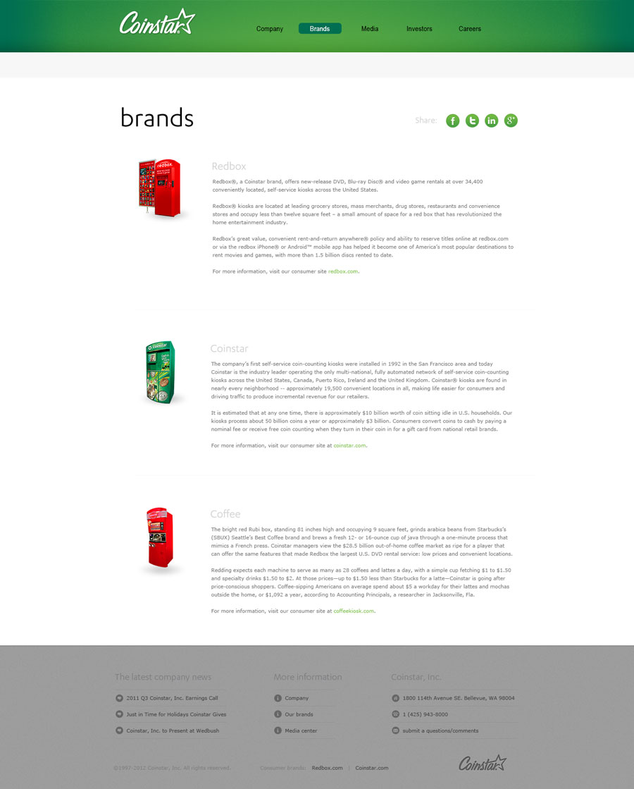
A vastly improved experience.
Leveraging more contemporary design patterns, clean page layouts, and simplified navigation scheme upon a modular framework, a vastly improved experience was delivered making it more engaging for customers and easier to update for internal teams.
Easier to manage.
Content sections were simplified and pages consolidated, with dynamic realtime information included where possible. A flexible navigation system and improved content management solution were also implemented, making information more accessible and easier to manage—improving overall content accuracy and timeliness.
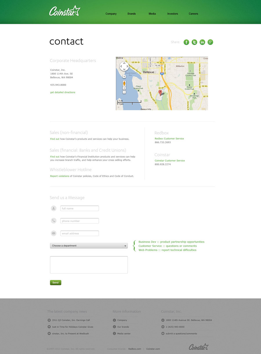
Results
Launching ahead of the Redbox announcement, the result was a vastly improved web experience showcasing Coinstar’s multi-platform, cross-industry product solutions. One more closely aligned with the company objectives of simplicity and convenience.
In the end, the new Coinstar corporate website saw a reduction in drop-off rates and an overall increase in customer engagement on site by approximately 37%. Ultimately allowing Coinstar to deliver on their promise of future innovations and promote their exploration new ventures.
CLIENT
Coinstar, Inc.
ROLE
Creative Direction & Front-End Development
YEAR
2012

