Coinstar Kiosk UI
Providing customers a more engaging and delightful coin-counting experience
Coinstar provides a convenient and reliable counting solution for cashing in excess coins. With nearly 20,000 locations worldwide, Coinstar kiosks are easy to find and use, helping consumers turn their loose change into cash for a small fee. However, outside the core function of exchanging coins to cash, customers had very little awareness of the NO FEE eGift card and charity donation options available at kiosks.
Looking to deliver on the promise of a deeper, more rewarding brand experience, Coinstar worked to redefine the user interface of their coin counting kiosks. This was a big step forward for them, with the addition many new innovative solutions that not only expanded the capabilities of their coin counting machines but also provided more options and a better user experience for their customers.
Redefining Coin Counting
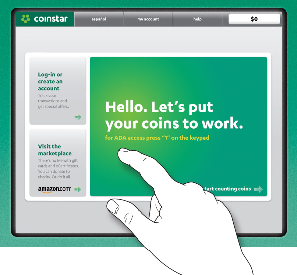
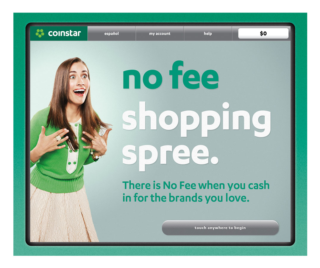
In order to raise awareness of their NO FEE options, optimize the coin counting experience, and build brand affinity with customers, Coinstar took the bold step to completely redefine their kiosk UI. The existing touch UI was functional but did very little to enhance the Coinstar brand, or adequately showcase the multitude of eGift card and donation options available.
Following on the heals of a recent brand refresh and web site update, Coinstar looked to leverage elements from both to deliver a more consistent consumer experience across their kiosks. New visual brand elements became critical input for the new UI system, prominently influencing the final look and feel, while new functionality and features from the website were added to the kiosk experience.
Requirements for the new UI design system included: 1) Incorporate the new Coinstar brand ID and achieve visual alignment with the website; 2) Balance complexity of new product offerings with the simplicity of the core cash offering; 3) Achieve a modern, sophisticated look and feel while remaining approachable and accessible to a wide range of users; and 4) Balance the look and feel of the UI with machine housing and retailer environment.
Kiosk Design System
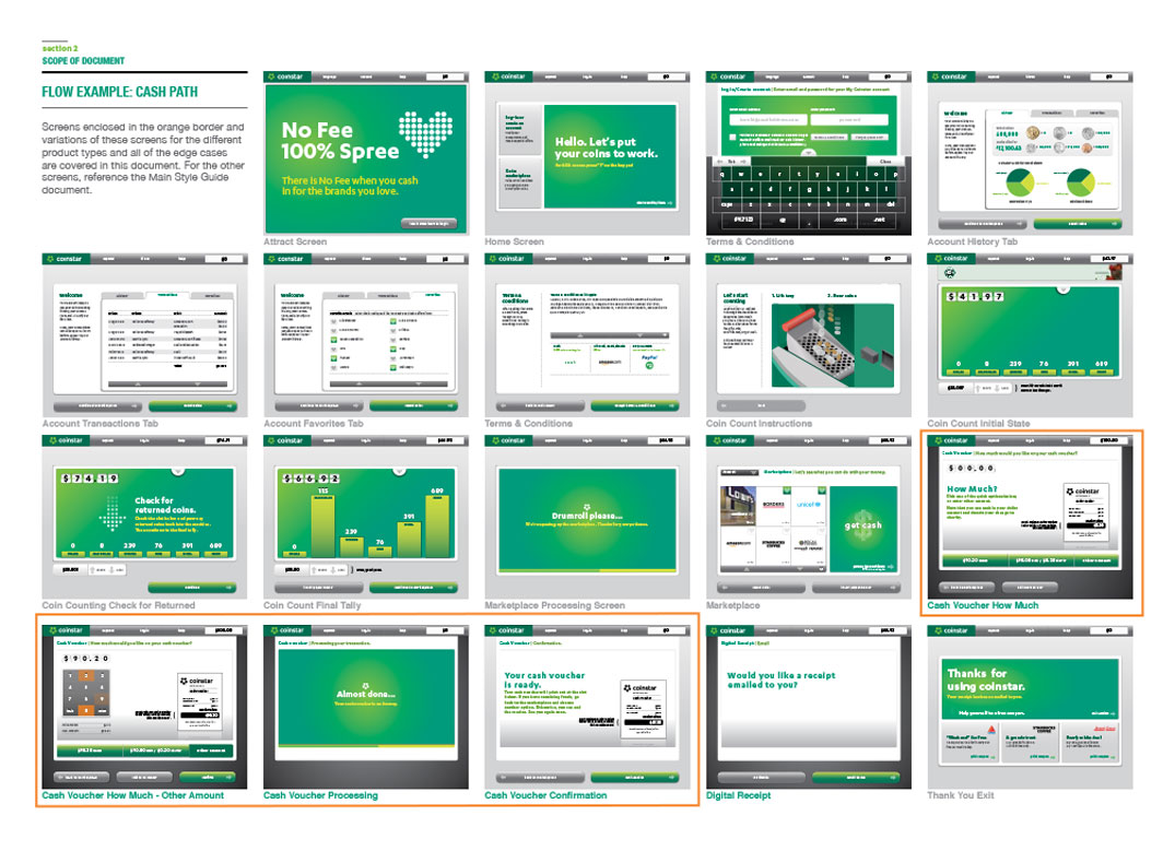
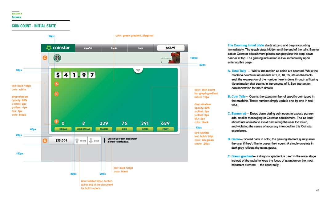
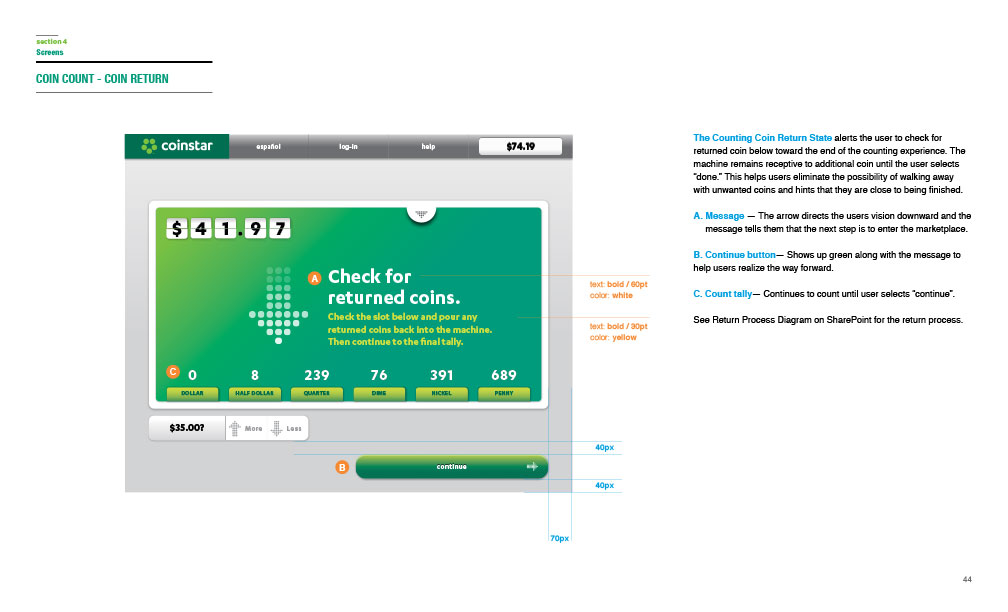
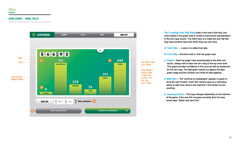
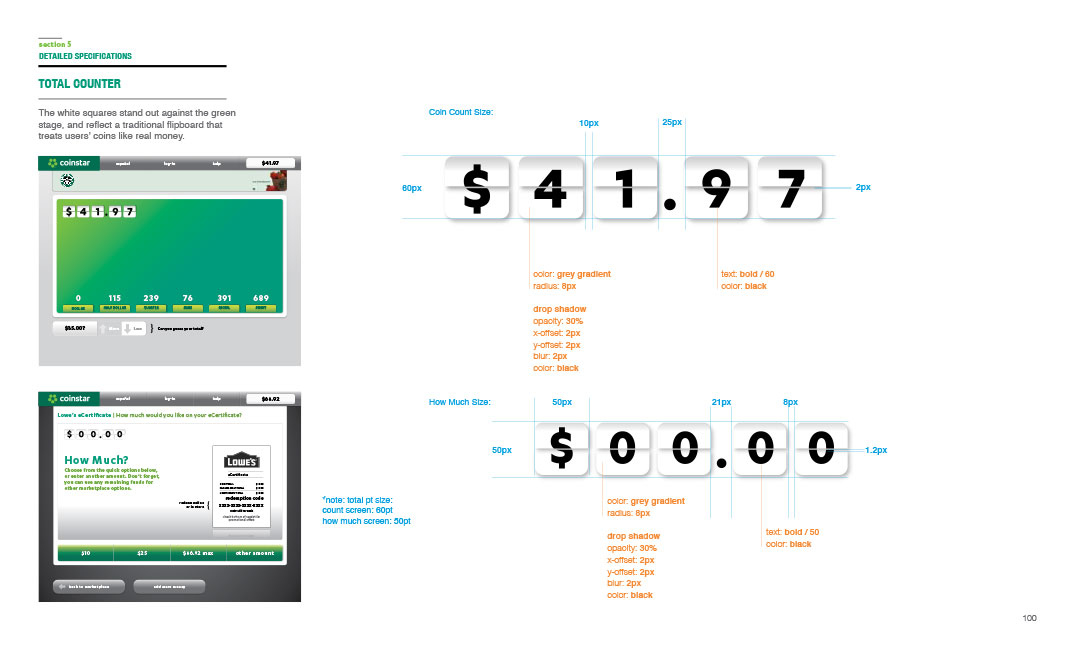
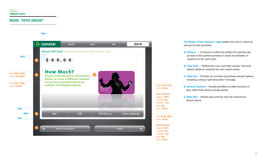
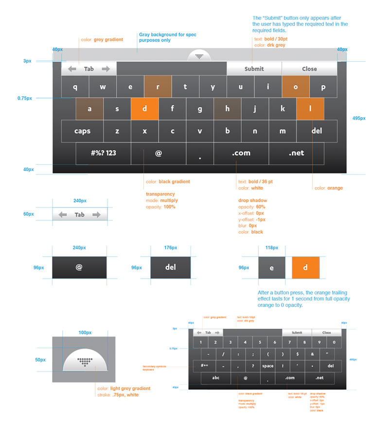
Leveraging existing inputs, including brand DNA and customer segmentation, along with a deep focus on the user experience, a design direction for the future of the Coinstar touchscreen UI was defined and extensively documented. The resulting style guide was intended to provide designers, product managers and engineers with a detailed guide to the design specifications of the new kiosk UI, while further defining user journeys and additional business goals.
Customer Marketplace
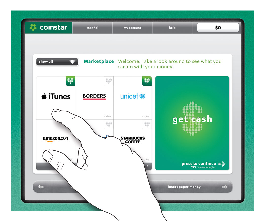
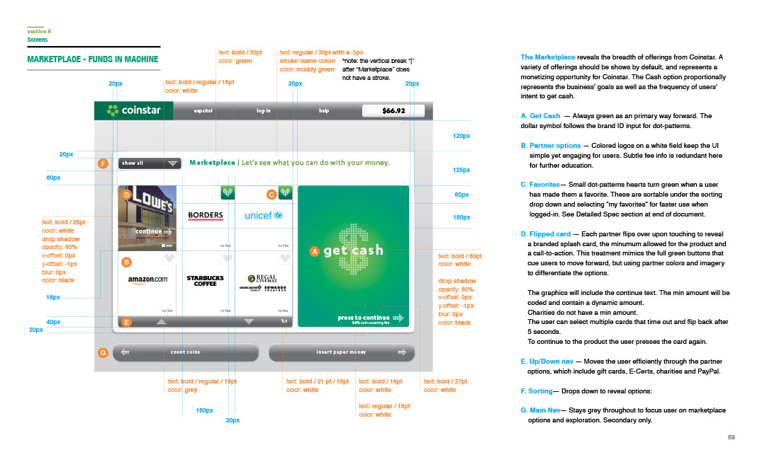
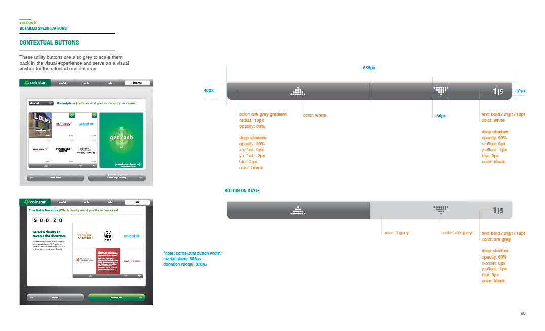
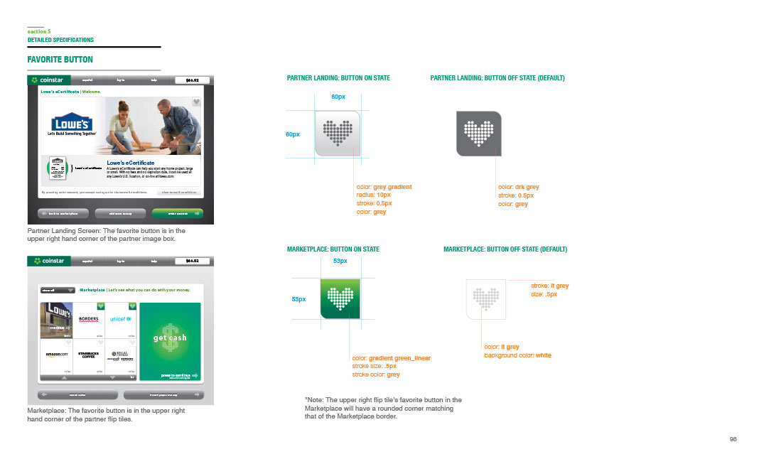
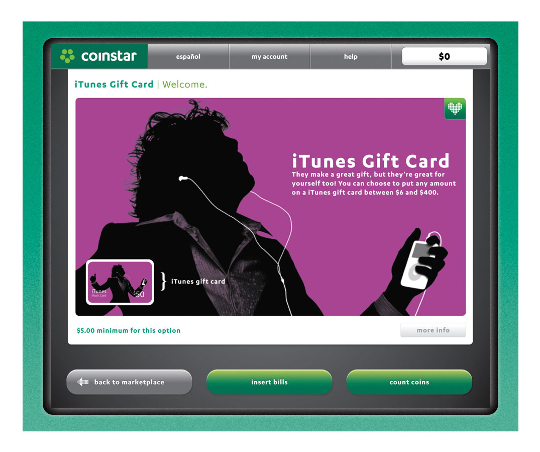
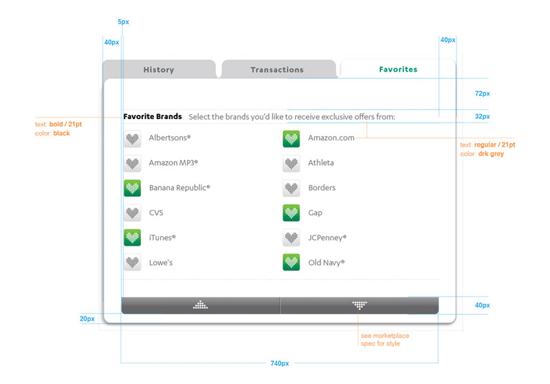
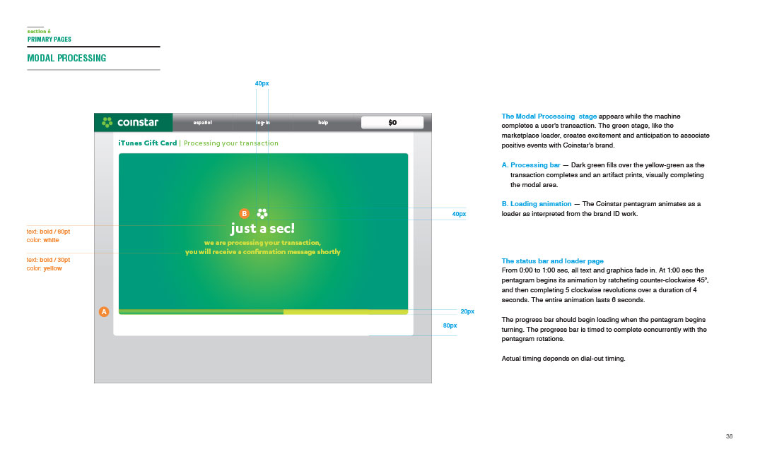
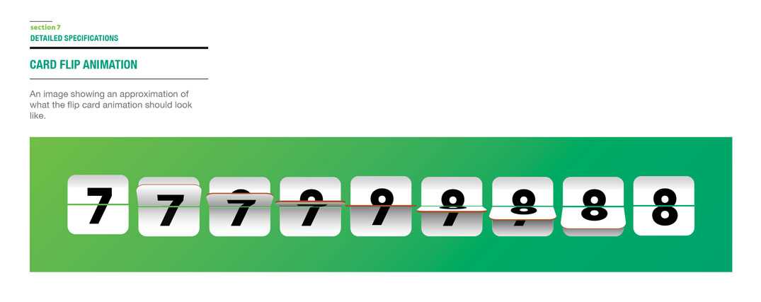
The Marketplace is the central hub of the new kiosk experience, revealing the breadth of offerings from Coinstar. After coins have been counted, a customer is taken to the Marketplace where a variety of transactional offers are available. In addition to the cash option, which is displayed most prominently based on engagement frequency and user intent, several other partner options are also available via flipcards. All of these will launch a modal series which takes the user through the transaction process. Recognized customers can favorite specific retailers for quick access in the future.

My Coinstar Account
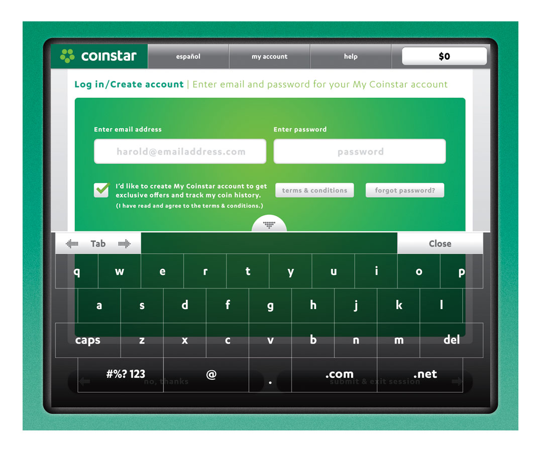
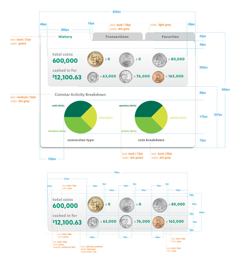
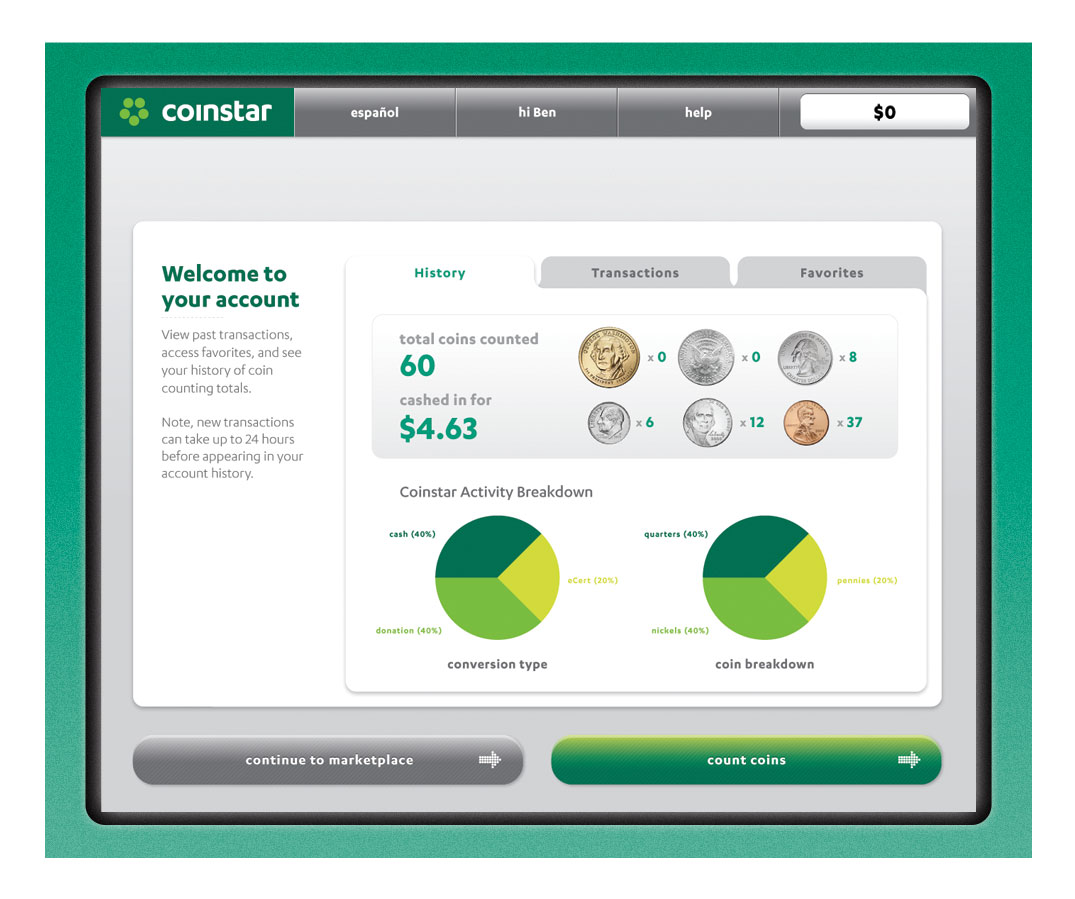
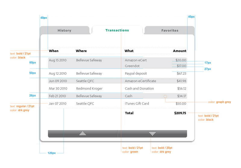
The new My Coinstar Account feature allows customers to access their personal information, pour history, transactions and favorites. This was a critical addition to the new kiosk experience, allowing customers to engage like never before. And, while login is not required to exchange coins, the experience is considerably improved upon doing so. Account access is available from almost any screen within the UI, increasing visibility and minimizing disruption to user flow.
Motion & Animation
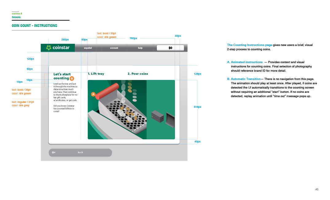
Simple motion patterns and instructional animations were an important part of the new Coinstar kiosk UI. Subtle motion elements were used to both inform the user of both taken as well as needed, and offered more playful visual interest to coin pouring and other features and affordances. Instruction-based animations were also available as simple how to elements to help customers at different points through their journey.

Results
“The new kiosk UI is a big step forward in building a deeper relationship with our customers, and marks an exciting new chapter in the future of our business.” — Coinstar Leadership
The resulting coin counting kiosk UI designs delivered on the promise of a deeper, more meaningful brand experience for Coinstar customers. This was a big step forward, with many new innovative features that not only expanded the capabilities of the coin counting kiosk but also provided more options than simply converting to cash. In the end, an elegant balance was struck between complexity of the new marketplace and simplicity of the core cash offering, while delivering a more modern, sophisticated look and feel that was both more approachable and accessible to a wider range of users.
CLIENT
Coinstar
ROLE
Interactive Art Director
YEAR
2010

