A Better Way to Browse
Amazon Video Framework
Amazon Video offers customers unparalleled selection and convenience, including access to the largest collection of digital movies and TV shows in one destination. With a Prime membership, Amazon customers gain access to tens of thousands of movies and TV episodes, such as award-winning Amazon Original Series, all Included with Prime at no additional cost. Or, Amazon Video users can choose from hundreds of thousands of videos to Rent or Buy, including new release movies and day after broadcast TV episodes.
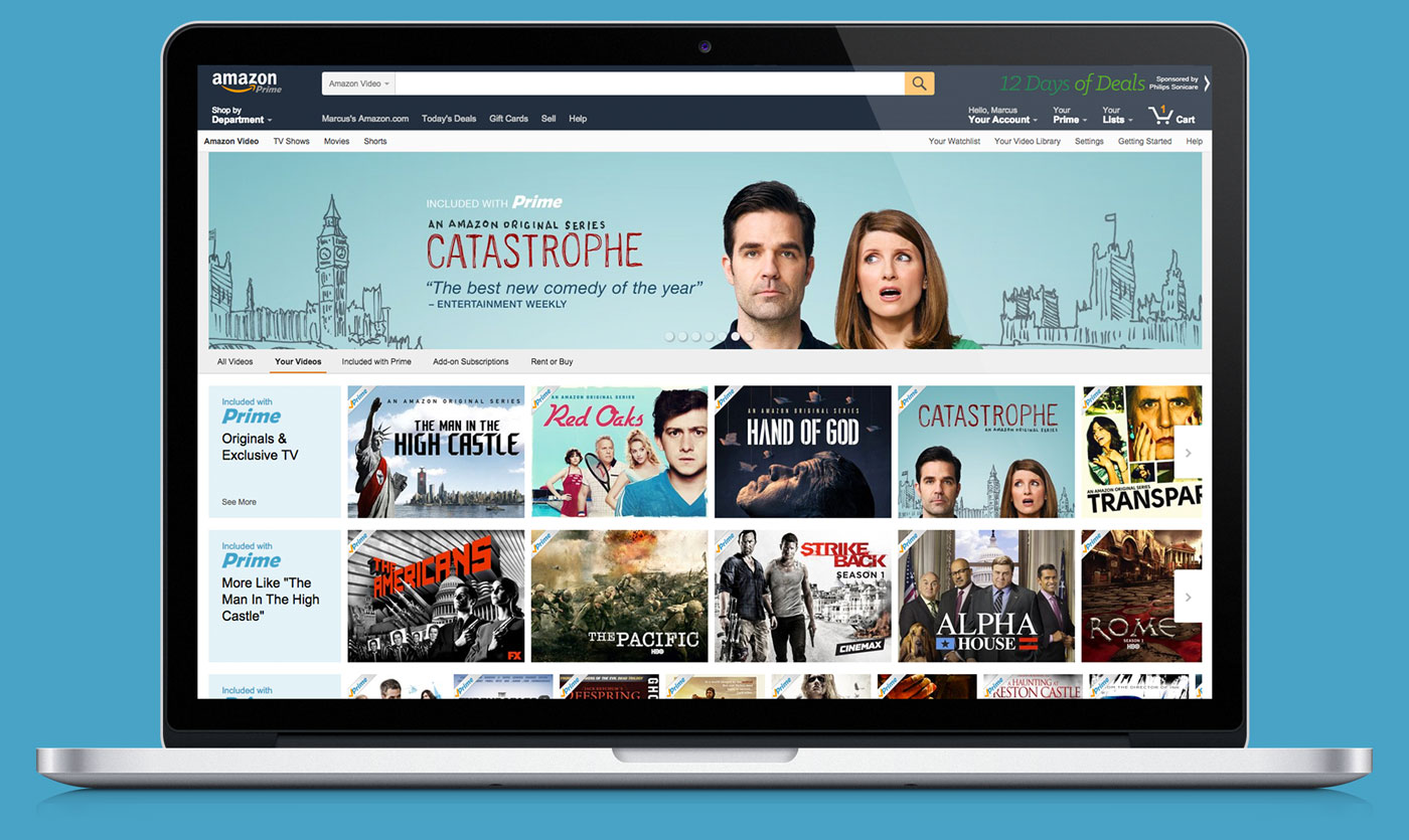
With all these great viewing options comes a level of complexity unmatched by other services. So, when Amazon Video released it’s latest offer type with Add-on Subscriptions—30+ ad-free channels such as STARZ, SHOWTIME, and more—in late 2015, we needed to rethink how content was surfaced and categorized for our customers. To improve the customer experience and reduce confusion we developed a new taxonomy, navigation, and browse structure for the entire Amazon Video service, including all platforms and client apps.


Design Approach
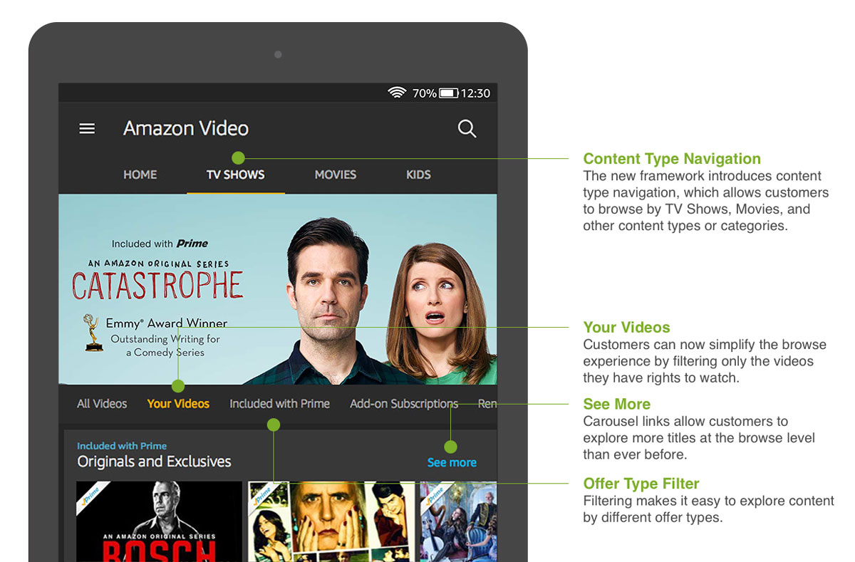
In the new Amazon Video interface we made minor but impactful modifications to improve the customer experience and create transparency between our four offer types — Included with Prime, Rent or Buy, Add-on Subscriptions, Free with Ads — making the service easier to navigate and discover video content. These service updates were driven by three primary tenets…
- Content carousels will be strongly typed, only containing titles from a single content and offer type.
- Carousels will use text, color, and branding to help customers easily identify the source of the content.
- We will create a place were customers can go to view just content that’s available for them to watch, including owned, Prime or paid subscription content
- Filters will be added across our applications allowing customers to explore content according to offer type—all content (the default), all subscription offers, content to rent or buy, and free (ad-supported) content.
Results
The updates to the Amazon Video service resulted in a more consistent and simplified purchase/viewing experience. Strongly typed carousels made it easier to browse the catalog and discover new or never before seen content. While, the offer type filters allowed customers to filter the catalog based on things they already had access to or could watch with a subscription or purchase. The purchase options on title detail pages were also simplified to highlight the best viewing option, such as via a subscription (Prime or 3P) or HD/SD transaction (Rent or Buy), rather than showing customers up to six different offers for a single title.
CLIENT
Amazon Video
ROLE
Cross Platform UX Leadership
YEAR
2015

