Fire TV Redesign
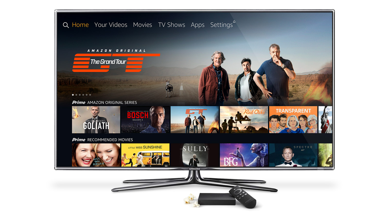
Amazon's next-generation living room UI
In late 2016, Amazon Video helped drive the release of a next-gen hero UI for Fire TV. This was a collaborative effort between Fire TV and Amazon Video, with the aim to deliver a more immersive, cinematic video-watching experience to customers, and set the design direction for other Amazon Video client applications into the future.
Fire TV’s new living room experience intended to delight customers with a more content-forward look & feel, which included the removal of unnecessary UI elements and a considerable simplification of the navigation. This also meant leaning more into the content itself, through the use of larger 16×9 covert art, bold background imagery, and a new (home) hero carousel with inline video trailers.
With so many prominent changes to the UI, it was critical to establish clear design patterns and creative guidelines for each of the various visual components early in the design process.
Hero Carousel (Home)
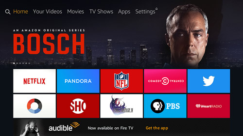
By simplifying the UI and reducing chrome, more space was available for a large billboard-like featured carousel on the home screen, offering customers a more-cinematic preview of new and upcoming TV shows & movies. Users of the new carousel, which appears in each main navigation section, are able to scroll left & right to quickly shuffle through featured titles.
16x9 Cover Art
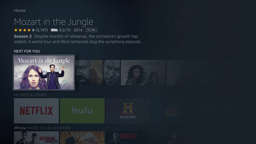
This wider, more modern cover art format was new for Amazon Video, which previously leveraged 4×3 (TV shows) and 3×4 (movies) aspect ratios on Fire TV. Creative guidelines were produced for the new wide-format image, and a graceful client-side fallback solution was created in the event that 16×9 cover art wasn’t available, reducing visual gaps in the UI.
Inline Video Trailers
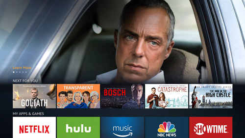
Another key step in delivering on the promise of a more cinematic experience was the integration of inline video previews to the Hero Carousel. Activated by hovering on a featured title, customers are delivered a more immersive look at popular titles through custom-cut trailers.
Background Images
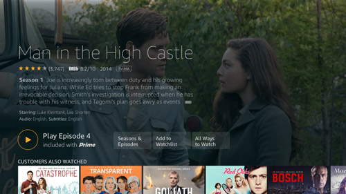
Content stills and gallery images were integrated into the UI at both the browse level, and as fullscreen backgrounds on content detail pages, offering customers more visual context while browsing the Fire TV catalog.
Optimizing for discoverability
With these UI updates and more, it was the biggest overhaul to the Fire TV since the device’s debut in April 2014, offering a more immersive, lean-back video-watching experience for customers. Additional usability improvements included better segmentation of content categories and a more muted browse environment, leveraging midnight blue and waves of black (mimicking a nighttime glow), to highlight the content over UI and making things easier to find.
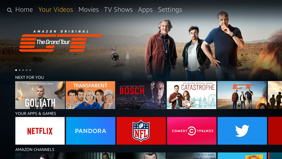
Your Videos
Another customer-centric update to the Fire TV UI, was the inclusion of a “Your Videos” option in the main navigation. This addition was the result of extensive testing by the Amazon Video UX Engagement team, in order to better understand how customers preferred to browse content. In overwhelming fashion, customers expressed a desire to filter by their own content—what they already had access to without requiring any additional purchase. The result was a dedicated section where customers are able to browse content that is available to them—whether through ownership or with a video subscription including Amazon’s Prime membership—requiring no additional transaction or commitment in order to watch.
❝
The new addition of “Your Videos,” which Amazon says addresses one of the most frequently-heard complaints by owners: that they couldn’t readily tell which would be paid content and which was free to stream.
— Slash Gear
❞
Viewing Options Modal
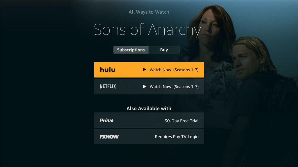
Along with the new Fire TV user experience came more seamless integration of content from other streaming services, including Netflix, Hulu, HBO, Showtime and more. As a result, a multi-option viewing modal was created, providing choices for watching a title available from multiple services. Extensive testing and pattern exploration was conducted by the Amazon Video UX Engagement team, resulting in a selection modal that offered customers the ability to select a service or transaction option (rent vs buy) that best fits their viewing needs. For example, if a customer is a subscriber to both Prime Video and Netflix, they have the option to choose their preferred service from which to watch, making Fire TV the most flexible platform for watching content both on and off Amazon’s own video service.
❝
As someone who has played around with nearly all the streamers at one point or another, from a sheer usability standpoint, this is probably one of the most exciting changes.
— Tech Crunch
❞
Creative Production
With simplification of the chrome and a more streamlined navigation, content was positioned as king within the new UI, allowing cover art to pop out of the screen with vibrant colors and visual contrast. As a result, title art and background imagery were in need of better creative definition and more timely production in order to hit the intended Fire TV launch date.
This meant 16×9 and background image coverage for tens of thousands of titles across all major AV markets (US, UK, DE, JP, IN). With just a few months to launch we had to move quickly to identify multiple design production options, eventually landing on the creation of a production design team located in SJO. In just a couple short months, I was able to recruit, hire and establish a team in San Jose Costa Rica with an efficient workflow process, including defined steps and stakeholders for sourcing, design and QA of all the assets, that resulting in the delivery of tens of thousands of assets and meeting the launch goals of the new FireTV UI.
Delivering on a better video experience
❝
All in all, from what I saw it’s a richer way of navigating the masses of content that streaming providers offer.
— Slash Gear
❞
Key UI updates provided a richer, more engaging way to navigate and created a more enjoyable lean-back video watching experience on Amazon’s premier streaming platform. And, the integration of more content options made it simpler for customers to find what they want to watch and how they want to watch it, no matter what video streaming service they subscribe to. The resulting next generation Fire TV experience delivered on the promise to make finding what to watch easier and more enjoyable for Amazon customers.
CLIENT
Amazon Video
ROLE
Acquisition & Engagement UX Leadership
YEAR
2016
